1. Getting Started
Xenon – is a light weight responsive admin theme built with latest Twitter Bootstrap 3.2.0 with plenty of UI components, layout variants and theme skins which contains a total of 128 HTML files.
Our first admin theme Neon was proof of success and its amongst 13 most popular themes ever on ThemeForest, but Xenon takes it to the next level of admin themes with good organization of files, clean coding and easy expanding.
Its built with LESS preprocessor of CSS which allows you to create your very personal version of Xenon by including only the components you need in one file.
1.1. Scope of this documentation
In this documentation we cover only the parts that we have added in Xenon thus Bootstrap and other plugins information is not contained here, but you can find their documentation on their respective website or Github.
Buttons, panels, and other elements are not documented how they can be styled, instead they are all presented and included in the demonstration, you just have top copy them and use for your own purpose. If you want to learn more about these buttons, just refer to Bootstrap documentation.
Additionally, code commenting is present everywhere where you have choices to make changes, here is one example for Sidebar menu:
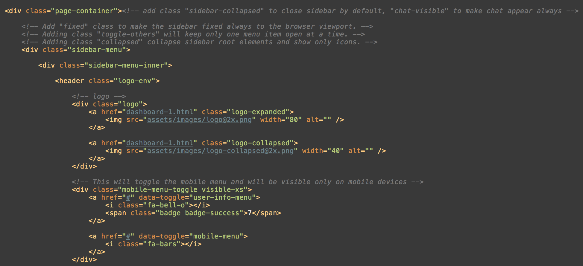
So you will find help comments while you are coding the template.
1.2. First steps with Xenon
To get you started with Xenon theme, you should be familiar with Twitter Bootstrap 3 which is widely used and most-preferred HTML framework from developers worldwide.
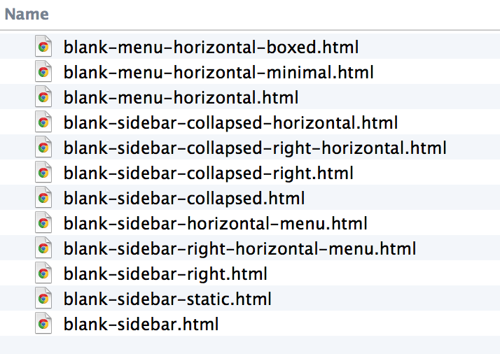
Firstly, open blank-sidebar.html file to know more about the main theme structure. It basically includes the markup that all other pages will include it too.
You have 13 blank templates we have created to help you to start your work directly and not create it from scratch.
2. Main Theme Structure
2.1. Basics
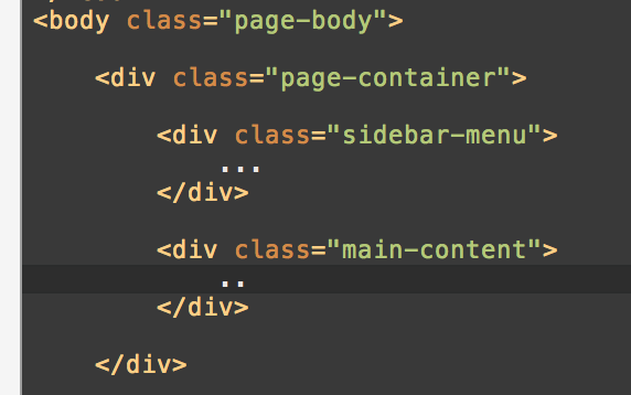
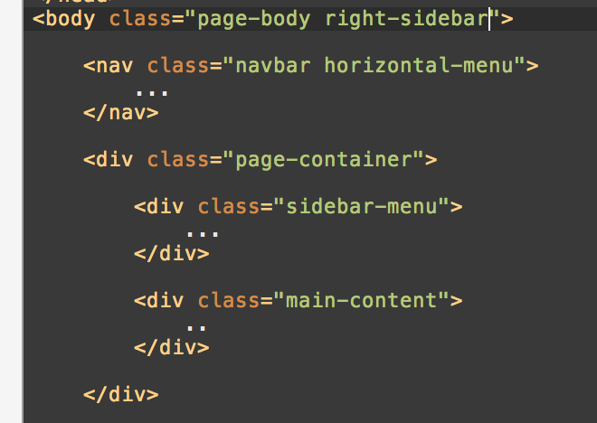
You are always required to have "page-body" class to <body> element.
The basic HTML structure (we are talking about Sidebar menu page):
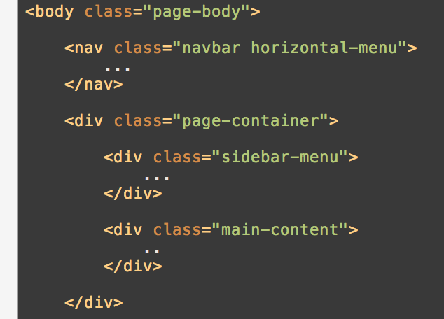
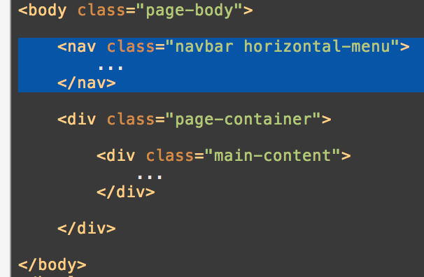
You can also assign Horizontal menu in the layout above:
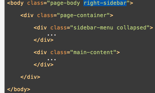
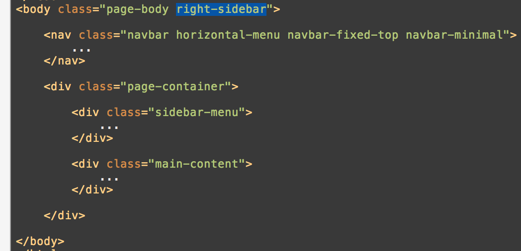
If you want to move sidebar to the right, just add right-sidebar to the body:
You will learn more about each layout variant in the sections below. To make things easier, we have created 12 startup files and all you have to do is to add content in the main container.
2.2. Sidebar Layout
Sidebar layout is set as the default layout for Xenon theme so all you have to do is to include the basic markup for the theme and you are all set:
= 
To place the sidebar to the right just add right-sidebar class to the body:
= 
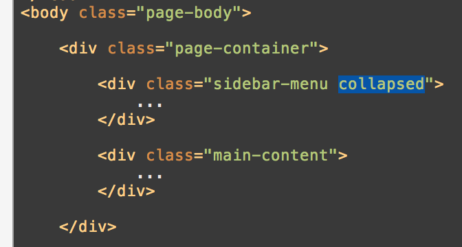
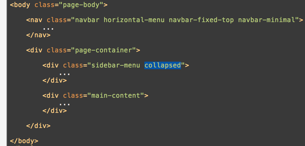
To collapse the sidebar add class "collapsed" to "sidebar-menu" container element:
 =
= 
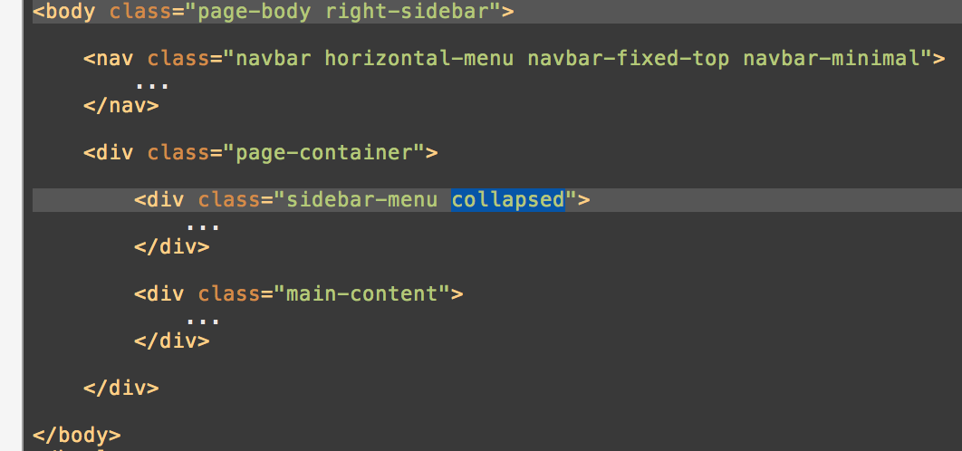
To move the collapsed sidebar just add the class right-sidebar to the body:
 =
= 
2.3. Horizontal Layout
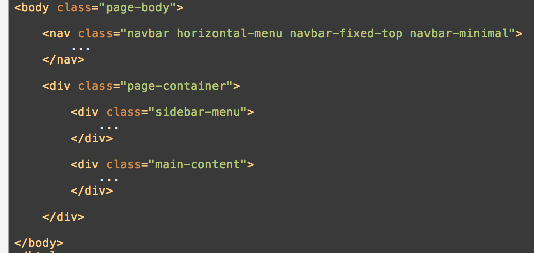
Horizontal layout has different structure of HTML, rather than appending it to the "page-container" it should be set before this container:
 =
= 
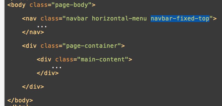
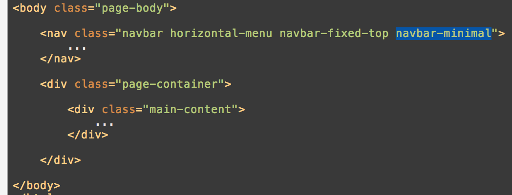
Thats it! If you want to make it sticky to the top just add this class to the horizontal-menu container:
If you think this menu is to thick, then adding class "navbar-minimal" will do the trick:
2.4. Combined Layouts
Joining two types of the menus in one page is fairly easy, so from the knowledge you took in the above topics, you just have to join them in HTML also. Intuition!
 =
= 
And sidebar to the right:
 =
= 
With collapsed sidebar:
 =
= 
Collapsed sidebar moving to the right:
 =
= 
2.5. Settings Pane
Settings pane is the user profile popup when client clicks on Wrench next to the logo:
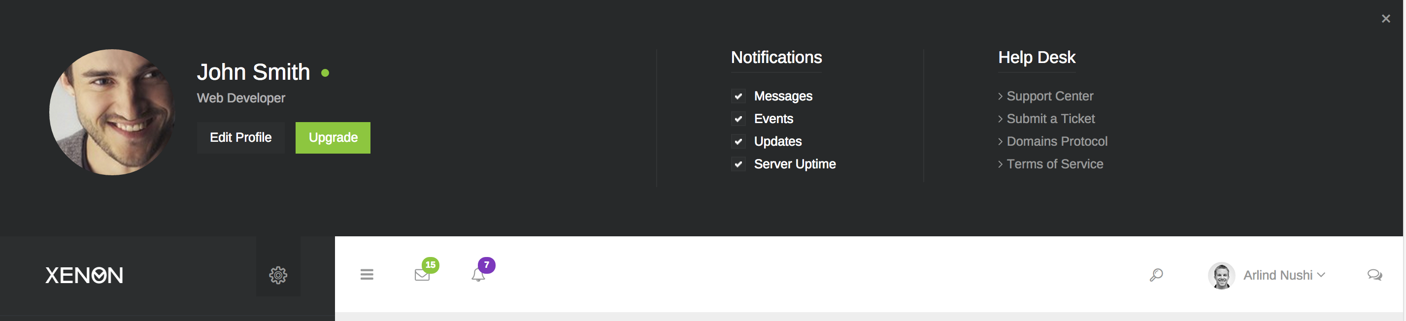
Here is the code structure you have to add:
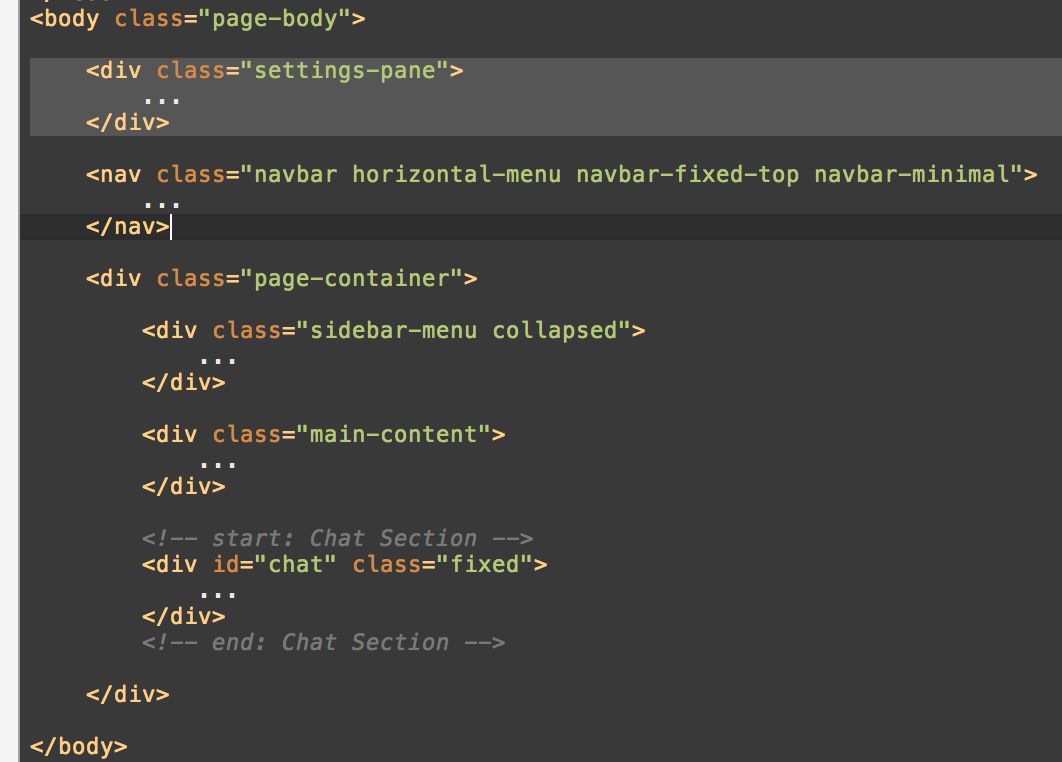
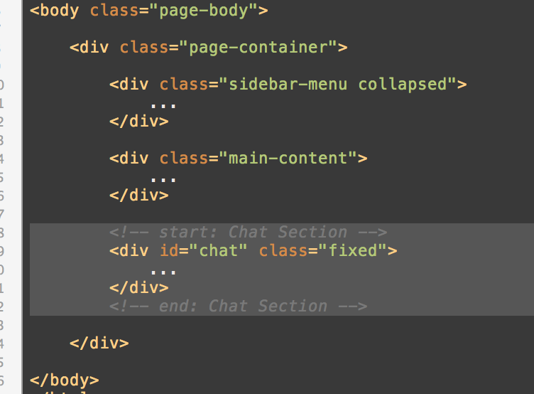
2.6. Chat
If you want to incorporate the chat, all you have to do is just append it to <div class="page-container"> container as last element:
3. Styling
This section requires LESS language knowledge, so you should know how this CSS preprocessor works, for more information read the documentation about LESS CSS here.
3.1. File Organization
Xenon has intuitive way of styles files organization and you will find very easy to adapt in the styling environment. You can easily locate each file based on the section you want to modify or remove.
Main files to compile are:
assets/less/bootstrap.less
assets/less/xenon.less
To add more flexibility, we have cut down xenon.less to four categories:
assets/less/xenon-core.less
assets/less/xenon-forms.less
assets/less/xenon-components.less
assets/less/xenon-skins.less
So wether you compile only this single file xenon.less or whole above four files (core, forms, components and skins) its the same thing. The reason we have split these files is because some browsers doesn't allow to contain more than 40,000 (if I am sure) CSS line declarations.
Secondly, in assets/less/ you will find three folders:
- bs-less
- other-less
- xenon-less
Their names describe the purpose of styling, so in bs-less you will find only bootstrap style files, in other-less there are the style files for some external plugins we include in this theme, and in xenon-less are the rest files that Xenon uses as primary style.
You will probably work mostly on xenon-less files if you want to modify the theme.
3.2. Compiling LESS to CSS
- WChanging LESS files will not affect the theme style until you compile them to CSS. So after each change you make, you must compile bootstrap.less and xenon.less (or separated files of xenon.less - core, forms, components and skins)
In case if you make changes to assets/less/bs-less/ files you have only to compile bootstrap.less and if you make changes to assets/less/other-less/ or assets/less/xenon-less/ you only need to compile xenon.less (or separated files of xenon.less).
When compiling the files via LESS compiler you must set Output file path to assets/css/{file-name}.css
How do I compile these files?
If you are a Mac user, I prefer you to use one of these apps to compile LESS files:
- CodeKit - https://incident57.com/codekit
- Koala - http://koala-app.com/
- Simpless - http://wearekiss.com/simpless
If you are Windows user then use any of these plugins:
- WinLESS - http://winless.org/
- Koala - http://koala-app.com/
- Simpless - http://wearekiss.com/simpless
3.3. Changing Theme Style Parameters
Most of users want to build their theme on they preferred colors, so in this case you don't need to modify each component and change for example their color or font size. We use a smarter technique for this. LESS CSS supports variables and they are life savers in this case. So all you have to do is to modify theme style parameters in these files:
assets/less/bs-less/variables.less
assets/less/xenon-less/variables.less
They contain all the needed variables to change primary, secondary and main colors.
After you change these files, you need to re-compile the Xenon style files.
3.4. Upgrading Bootstrap
Since Bootstrap is main factor in Xenon theme, you are likely to update the Bootstrap framework. Xenon supports this and its very easy to do so. Currently the latest version of Bootstrap which is supported in Xenon is Bootstrap 3.X.X.
When new version of Bootstrap comes out, you must download source files from Github of Twitters Bootstrap. After this, create backup of current version bootstrap included in Xenon (folder name: bs-less, folder location: assets/less/) and delete the files inside this folder.
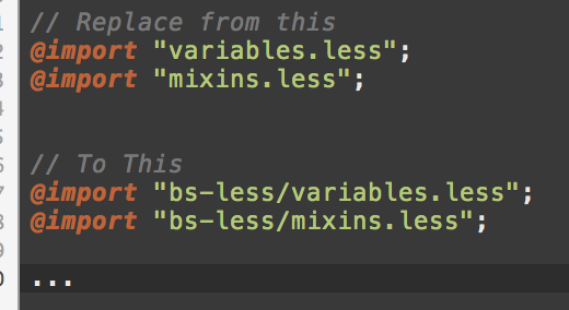
Then copy files of downloaded Boostrap located inside less/ and move them to bs-less/ directory. Move this file assets/less/bs-less/bootstrap.less to assets/less/bootstrap.less and change the path of imports inside this file, example:
Remember that you need to replace variables in bs-less/variables.less from the base version of Xenon, otherwise theme colors, font sizes and some other styling settings will look different and not good.
However, we will always update Xenon to the latest version of Bootstrap, but this knowledge will serve you to upgrade or downgrade.
4. Other
4.1. Scripting
Main scripts instances of the theme are executed on assets/js/xenon-custom.js so if you want to learn more how they coded read the code. Its all commented to help you understand what does what.
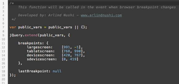
Browser Intent - Responsive
For responsiveness, we have created xenon.resize event that is applied on $(window) and tells you when the window has been resized. This is special event because it fires only when the window has finished the resizing, not every pixel it has been resized. They you can use helper functions to detect the device type and they are:
- is(device_type);
- Example: is('largescreen'); or is('tabletscreen'); or is('devicescreen'); or is('sdevicescreen');
- ismdxl(); // true when screen size is large screen or tablet screen
- isxs(); // true when screen is smaller than tablet
You can change the breakpoints or add custom on this file: assets/js/resizeable.js
4.2. Charts JS Documentation
We use an extraordinary library for Chart drawing, and you may probably be interested how to build custom charts:
For chart examples click here to see them.
4.3. Keeping Track of Imported Scripts/Styles
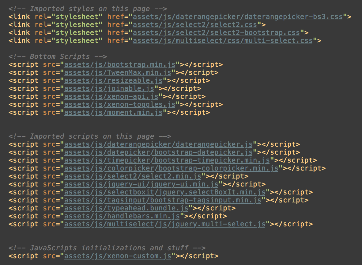
If you want to know which scripts are imported on several pages, you can easily see in the footer of each HTML file described with HTML comments, here is an example of forms-advanced.html that uses resources in order to make it work properly:
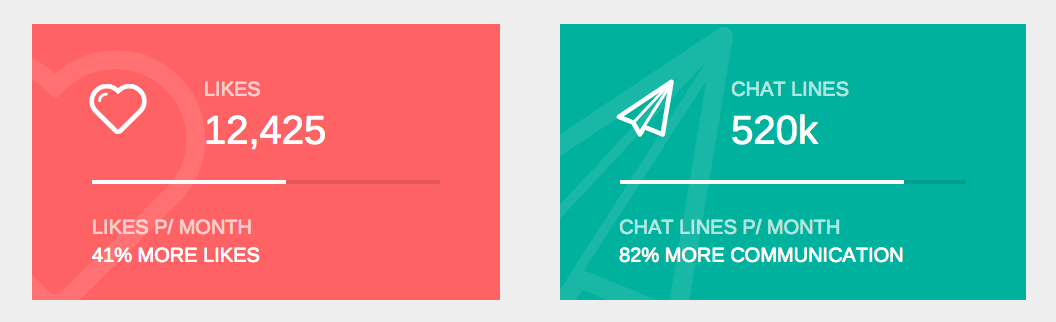
4.4. Counter Widget
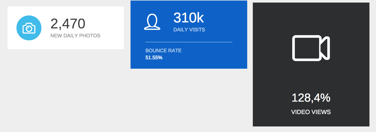
Counter widgets start counting with From-To variables and have different options such duration, delay, prefix, suffix and other things. These counters start only when the element is shown in viewport.
You can count anything and customize the animation, example counters are:
The syntax/markup for counter is:
<span data-count="this" data-from="0" data-to="99.9" data-suffix="%" data-duration="2"></span>
This will append the counting variable to this SPAN element and will start counting from 0 to 99.9 with % suffix and the counting will be done in 2 seconds.
The full syntax of counter can be like this:
<div data-count="this|.selector" data-from="int|float" data-to="int|float" data-prefix="string" data-suffix="string" data-decimal="." data-easing="boolean" data-duration="int|float" data-delay="int|float"></div>
Variables can be filled in these ways:
- count (optional, default: this) - if you set "this" value it will count within that tag, if you put jquery selector, then the selected element within that container will be animated
- from (required) - Starting number, can be with floating point
- to (required) - Ending number, can be with floating point
- prefix (optional) - String to prepend before the counting number
- suffix (optional) - String to append after the counting number
- decimal (optional) - Decimal separator character
- easing (optional) - True or false, whether to count with easing algorithm or not
- duration (optional, default: 2.5) - How long will it take to count from-to numbers
- delay (optional, default: 0) - How long should the element wait before starting to count
4.5. Fill Widget
Fill widget will animate CSS property based on from-to number, its the same as the Counter Widget, but this will handle the styling of element, such as width, height, opacity, position and so on.
Example fill widgets:
The markup for Fill Widget is:
<span data-fill-from="0" data-fill-to="56" data-fill-unit="%" data-fill-property="width" data-fill-duration="2" data-fill-easing="true"></span>
The above example will animate the width of the SPAN element from 0 to 56 (percent) within 2 seconds.
Full syntax/markup for this widget can be:
<div data-fill-from="int|float" data-fill-to="int|float" data-fill-property="width" data-fill-unit="string" data-fill-duration="integer" data-fill-easing="boolean" data-fill-duration="int|float" data-fill-delay="int|float"></div>
Variables can be filled in these ways:
- fill-from (required) - Starting number, can be with floating point
- fill-to (required) - Ending number, can be with floating point
- fill-property (optional, default: width) - Property to be populated with from-to numbers
- fill-unit (optional, default: %) - String to append after the counting number
- fill-easing (optional) - True or false, whether to count with easing algorithm or not
- fill-duration (optional, default: 2.5) - How long will it take to count from-to numbers
- fill-delay (optional, default: 0) - How long should the element wait before starting to count
5. Ready to Use Markup
5.1. Sidebar Menu
5.2. User Settings Pane
5.3. Chat
5.4. Horizontal Menu
6. Xenon with AngularJS
In Xenon Angular version, everything starts from app.js which is located in app/js/ folder. To get started open and analyse it firstly.
6.1. Controllers, Directives, Services and Factory
Controllers - Are the main part of the theme which handles the interactivity and provides with the data source and template files. Controllers are set up in app/js/controllers.js
Directives - includes the markup templating and are shortcuts of some elements that are used in plain HTML version of Xenon for example Widgets, Sidebar, Horizontal Menu and so on. Xenon includes 29 predefined directives for different purposes. Directives are set up in app/js/directives.js
Services - Xenon has developed a technique for dynamic menu displaying and this is implemented as a service and its called $menuItems. For more you will learn in the upcoming below section about managing menu items. Services are set up in app/js/services.js
Factory - includes the layout functionality functions and progress loader. You will learn more about factory functions in the below sections. Factory functions are set up in app/js/factory.js
All these components are included in the main app file in index.html and then are injected within angular module:
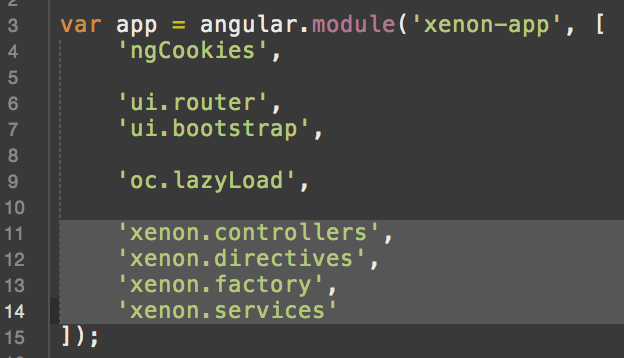
Other dependencies such as ui.router, ui.bootstrap, ngCookies and oc.lazyload make the core functionality in the Xenon theme, they must be included in order to make the theme works properly in AngularJS.
6.2. Adding menu items and creating views
Adding menu item to sidebar or horizontal menu requires to edit two files: app/js/services.js to add the menu item in list, and app/js/app.js to setup the view for the menu item.
If you want to add an item to the menu in the Xenon way follow these steps:
Note: You can also implement menu in different way and this method will fall off.
- Open app/js/services.js
- If you want to add sidebar menu item go to function "prepareSidebarMenu"
- If you want to add horizontal menu item go to function "prepareHorizontalMenu"
- Note: These functions are called in app/js/controllers.js in "SidebarMenuCtrl" and "HorizontalMenuCtrl" controllers.
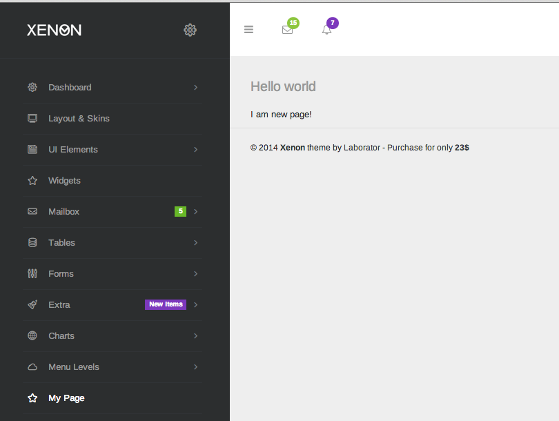
- Lets add for example "My page" menu item in sidebar (the same steps are valid for horizontal menu also)
- Right after line 96 add this line:
- var my_page = this.addItem('My Page', '/app/my-page', 'linecons-star');
- function description: addItem(menu_title, route_path, icon_class);
- The reason why we have created "my_page" variable is for later access to add sub menu items or set label.
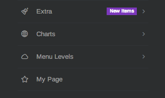
- The menu item is now added to sidebar:
- Now its time to connect this menu item with the route/state and display a view.
- Go to app/tpls/ and create file name my-page.html for example
- Open app/js/app.js and navigate to app.config function
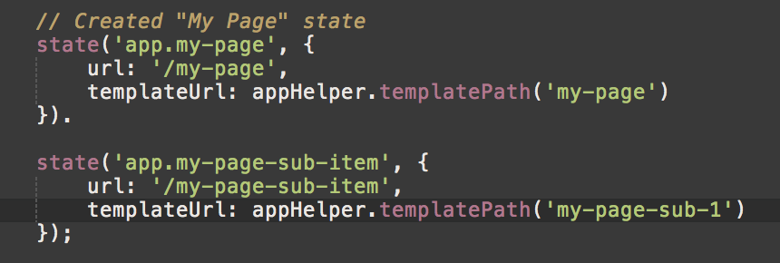
- Add the state to $stateProvider object:
- Create state "app.my-page" like shown here: http://pastebin.com/SpvF0RA8
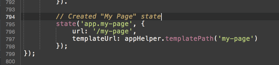
- This will connect the /app/my-page from the menu item with app.my-page state in the app.js and execute the given templateUrl, and this is how it will look like:
- Create state "app.my-page" like shown here: http://pastebin.com/SpvF0RA8
- You are all set. Menu item is added successfully. If you want to add submenu item, just use the "my_page" var to add the menu item, for example:
- my_page.addItem('My sub menu', '-/sub-item') - "-/" means it will be appended to the parent link "/app/my-page-sub-item"
- Then creating new state will be like:
6.3. Layout Options
Layout options are stored in cookies and provide an API to change them, but you can also apply manual configuration. To change layout settings open app/js/controllers.js and head to "MainCtrl":
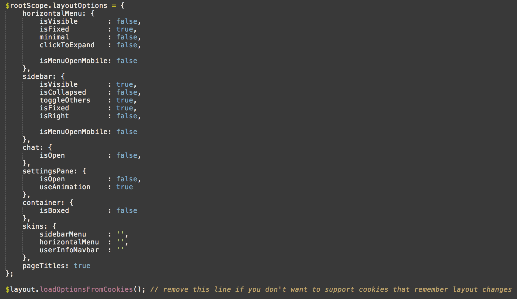
All layout functionality is related to $rootScope.layoutOptions and you can configure it easily by changing the object variables. To disable cookie stored values just remove this line of code: $layout.loadOptionsFromCookies();
To change a layout option via API you must inject $layout argument to the controller/directive or anywhere else. Altering layout options is as easy as you see, just write the path of the option, for example if you want to display chat write this code:
$layout.setOptions('chat.isOpen', true);
It will be saved in cookies and Xenon will remember the setting next time you refresh the page. You can configure which settings are saved in cookies, just open app/js/factory.js go to line 215, and edit/move/delete the entries in the "propsToCache" property.
6.4. Dependency Loading
When you need to import external resources such as JavaScript or Stylesheets you should do this with the "resolve" object inside app.js in $stateProvider:
You can load as many dependencies as you want, just add the entries to the resolve object with $ocLazyLoad parameter.
6.5. Ready to Use Directives
Here is the list of predefined directives that you can use in your Xenon AngularJS layout:
6.5.1. settingsPane
Usage: <settings-pane></settings-pane>
Function: Will include the user settings pane, add this markup to the beginning of the app (before "page-container" and horizontal menu element). Settings pane toggle function is: settingsPaneToggle();
6.5.2. horizontalMenu
Usage: <horizontal-menu></horizontal-menu>
Function: Will display the horizontal menu, search bar and user notifications. This should be added before "page-container" element and can be used only once.
6.5.3. sidebarMenu
Usage: <sidebar-menu></sidebar-menu>
Function: Will display the sidebar menu. The usage of this directive is inside app/tpls/app-body.html if you want to learn more.
6.5.4. xeCounter
Usage: <div class="xe-widget xe-counter" xe-counter data-count=".num" data-from="0" data-to="99.9" data-suffix="%" data-duration="2"></div>
Function: Will start counting the specified "data-count" element right after is shown in the screen. For full options check Section 4.4
6.5.5. xeFillCounter
Usage: <span class="xe-progress-fill" xe-fill-counter data-fill-from="0" data-fill-to="56" data-fill-unit="%" data-fill-property="width" data-fill-duration="2" data-fill-easing="true"></span>
Function: Will start filling CSS properties for the specified element that contains xe-fill-counter attribute right after is shown in the screen. For full options check Section 4.5
6.5.6. xeStatusUpdate
Usage:
Function: Will display the status update widget.
6.5.7. Other Directives
There are total of 29 directives included in this theme, for full list open this file app/js/directives.js to learn more detailed information and how are they implemented.
7. Credits
Xenon wouldn't be this great if the staff of Laborator, Arlind Nushi and Art Ramadani wouldn't be part of this project, neither without the presence of these great plugins, graphics and other resources:
- Twitter Bootstrap
- GreenSock
- Perfect Scrollbar
- DevExpress Charts
- jVectormap
- FullCalendar
- Google Webfonts
- Toastr
- Knob
- Select2
- SelectBoxIt
This line is getting to long, so here is the horizontal listing:
Select2, SelectBoxIt, CK Editor, Color Picker, Cropper, DataTables, DatePicker, Date Range Picker, Drop Zone, Form Wizard, iCheck, Input Mask, jQuery Validate, jQuery UI, Multi Select, RWD Table, Tags Input, Typeahead, Time Picker, Tocify, UI Kit, Wysihtml5.